Content Playbook
Lowe’s first Content Playbook—an evolving system that standardizes voice, tone, and accessibility across platforms.
Systems & Standards
Company: Lowe's
Industry: Home Improvement
The Challenge: Lowe’s content across digital products had grown increasingly inconsistent in tone, structure, and accessibility. Teams were reinventing patterns, interpreting standards differently, or making content decisions in silos, leading to wasted time and uneven customer experiences.
The Process: I audited 300+ examples of UX copy across product teams to identify patterns, gaps, and inconsistencies. From there, I partnered with design, brand, and accessibility to define shared principles for voice, tone, structure, and clarity. Each section of the playbook was prototyped, tested with real teams, and refined to ensure it felt intuitive and easy to adopt.
The Impact: The playbook became a unified content system used across product teams. It aligned voice and tone, strengthened accessibility practices, standardized patterns, and empowered teams to make decisions on their own. To ensure the guidelines could scale, I integrated them into a ChatGPT-powered assistant—giving designers real-time guidance and freeing content designers to focus on strategic work.
Here are a few highlights from the guidelines:
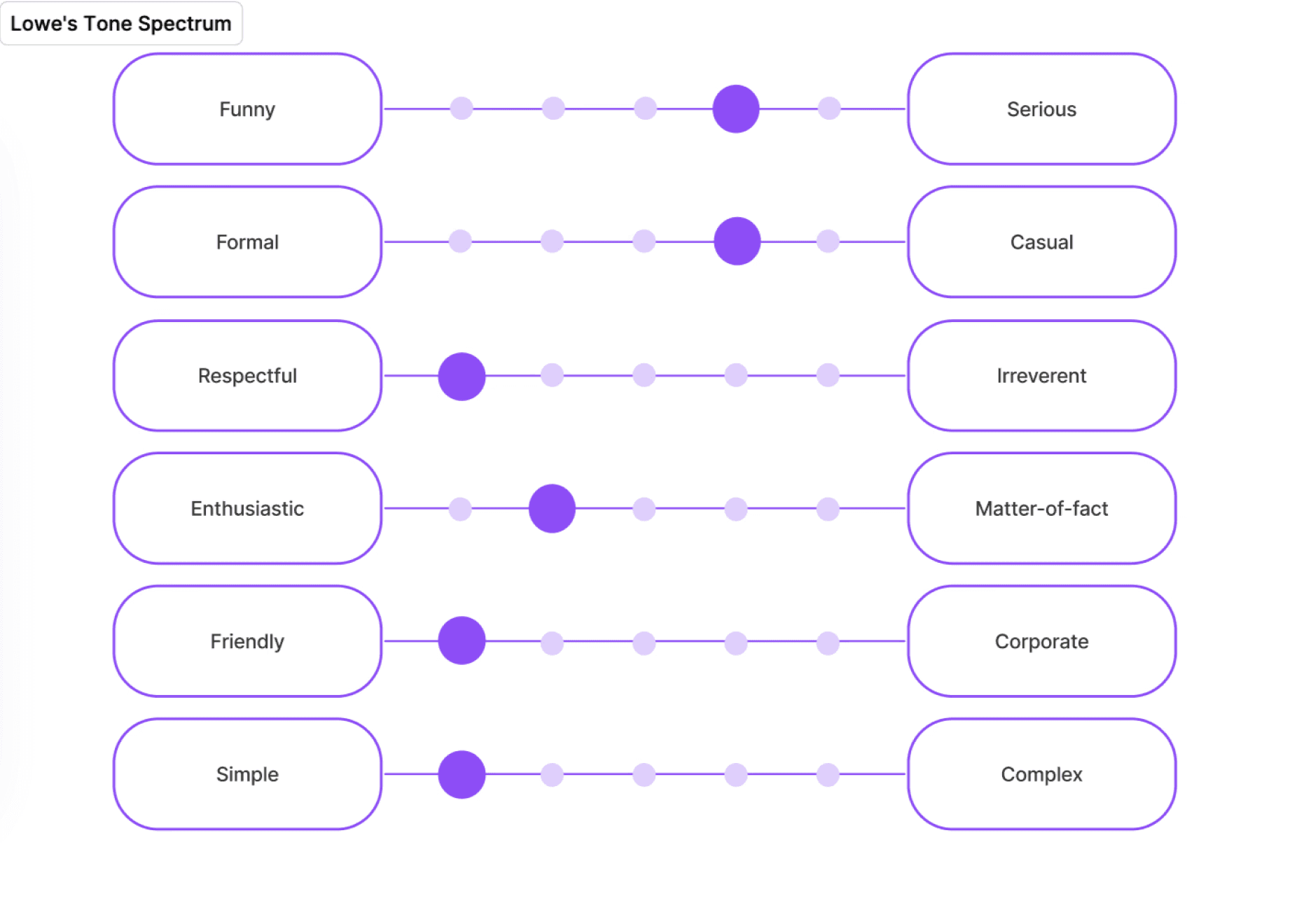
Tone Guidelines: Many teams struggled to match Lowe’s voice—some sounded overly formal, others too casual or verbose. I created a tone spectrum to show how our voice flexes across contexts: instructional guidance, warnings, onboarding moments, and conversational UI.
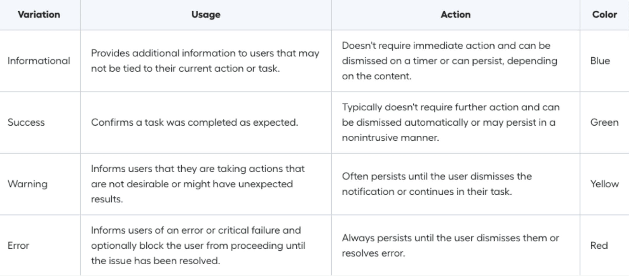
Usage Guidelines: Notifications were one of the most inconsistent surfaces across products. I developed a clear framework defining:
Variations (informational, success, warning, error)
When to use each type
What actions they should support
Color and hierarchy rules
This helped designers choose the right notification pattern without guesswork, reducing ambiguity and improving cross-platform consistency.
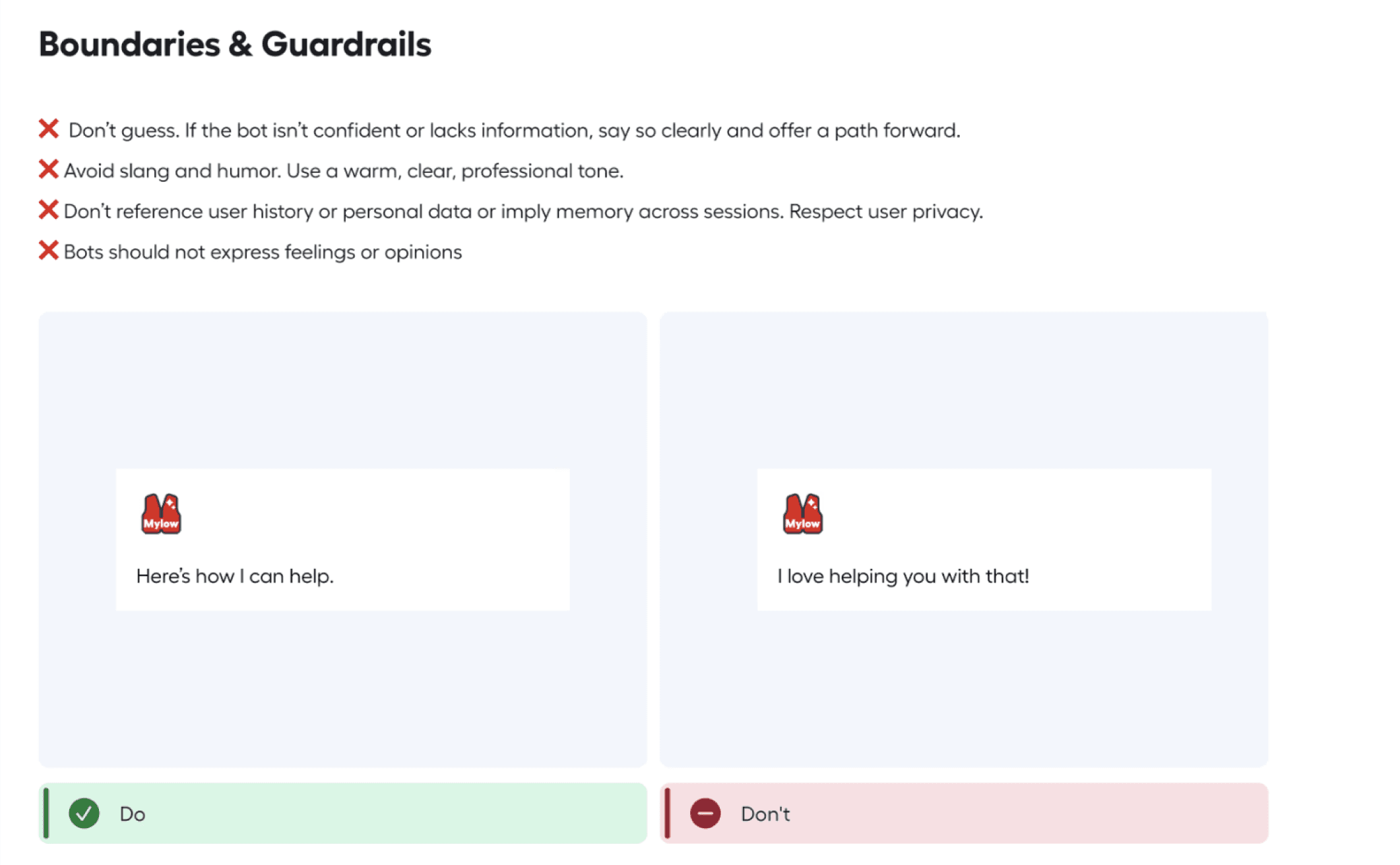
Boundaries & Guardrails: As conversational UI became more common—especially with our AI assistant—teams needed clarity on how human the voice should be.
I created simple guardrails outlining:
What the assistant can say
What it should never assume
How to stay helpful, respectful, and within compliance
Examples of phrasing that feels appropriately human without crossing personal boundaries
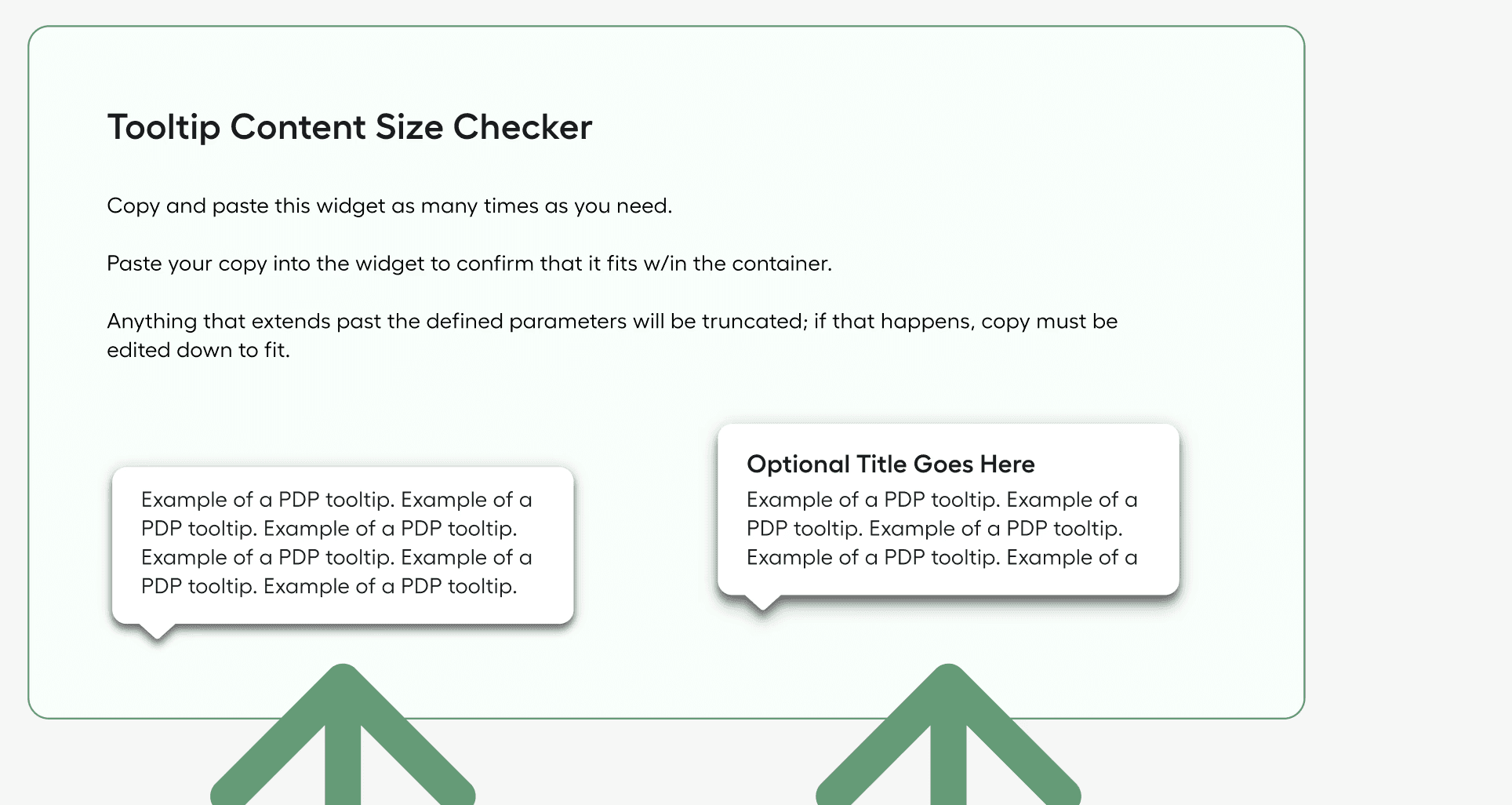
Quick Tools: Tooltips were often overwritten, causing truncation or visual overflow. To solve this, I created a tooltip size checker so designers could instantly see whether their copy fit the container and how it would behave at different breakpoints.
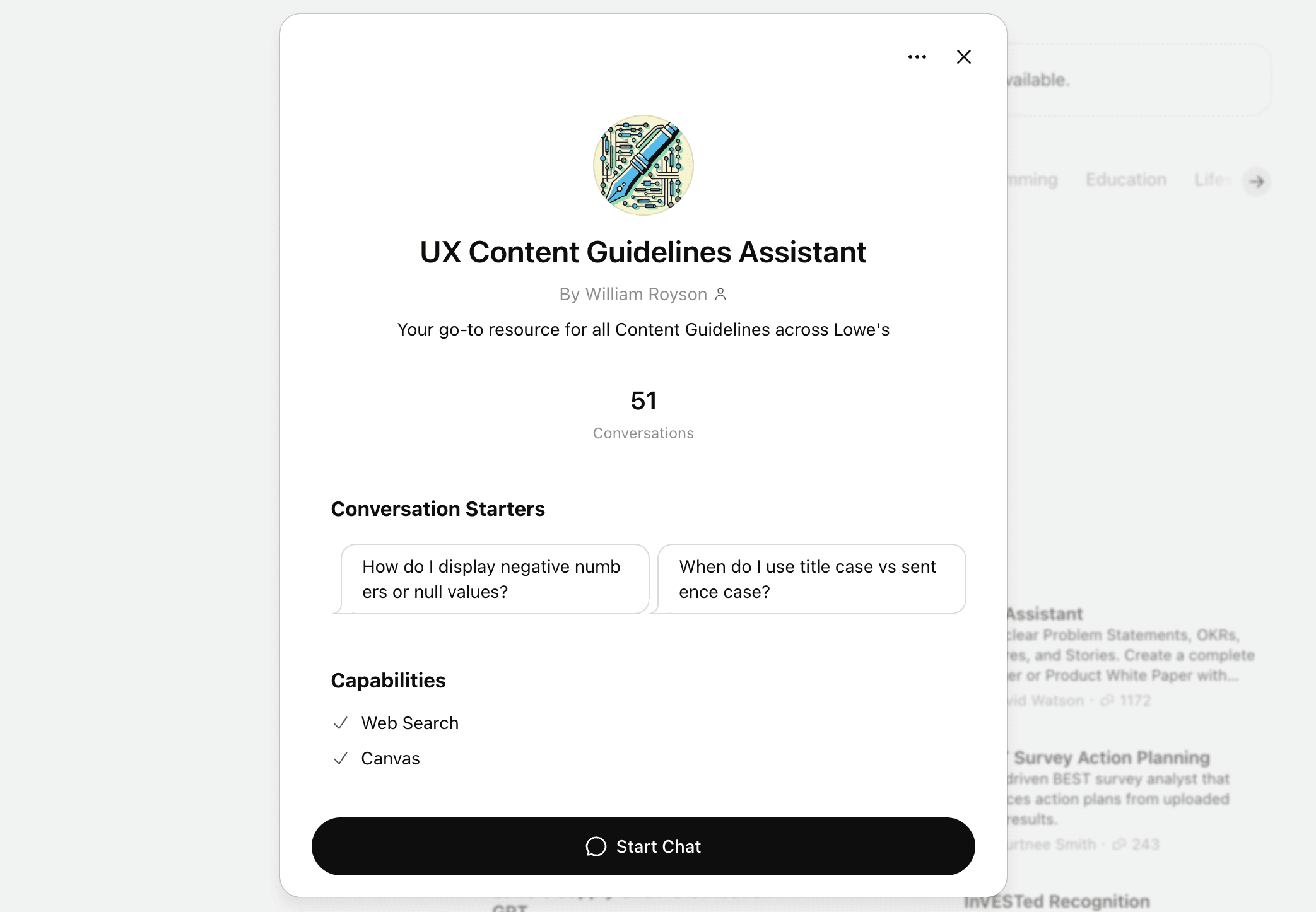
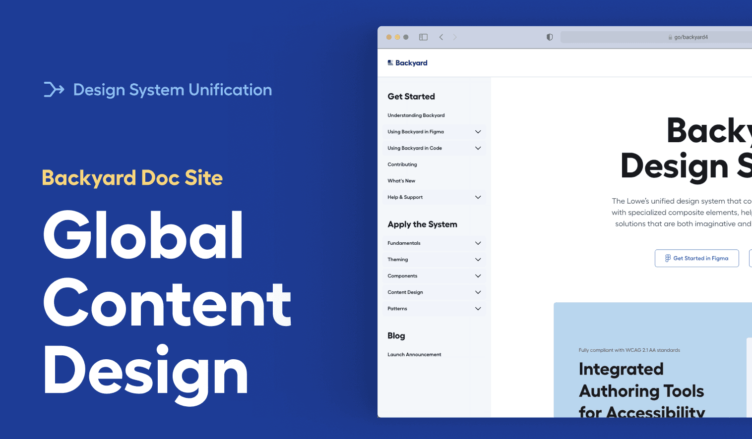
ChatGPT Integration: To make the playbook scalable, searchable, and usable in the moment, I integrated our standards into a ChatGPT-powered assistant.
Designers could now ask questions like:
“When do I use sentence case vs. title case?”
“How do I write a warning state?”
“What’s the tone for instructional content?”
The assistant delivered answers instantly, with examples pulled directly from our playbook.
This transformed the guidelines from static documentation into an everyday decision-making tool.